
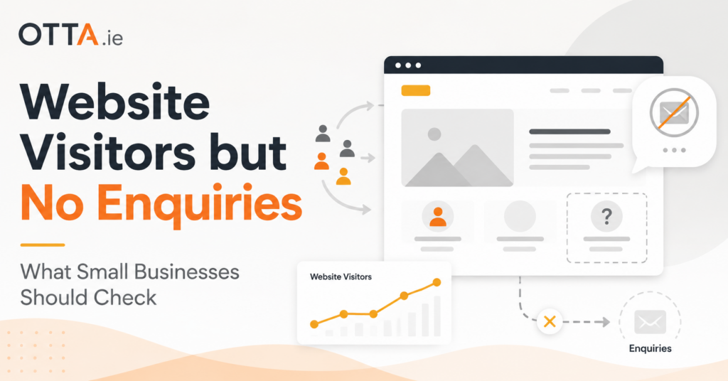
Getting website visitors but no enquiries is one of those problems that can send a business in the wrong direction very quickly.
The first reaction is often: we need more traffic.
Sometimes that is true. But if people are already reaching the website and still not contacting you, paying for more clicks can simply mean paying to send more people into the same problem.
Before spending more on advertising, SEO or a redesign, I would check the conversion path first.
More Traffic Is Not Always the Answer
Traffic only tells you that somebody arrived.
It does not tell you whether they understood the business, trusted what they saw, found the right service, knew what to do next or were actually able to contact you.
That distinction matters.
A small business website does not need thousands of visitors to be useful. It needs the right visitors to understand the offer and take the next sensible step.
If that step is unclear or broken, increasing traffic is usually not the first thing I would recommend.
Start With the Most Boring Check: Does Contact Actually Work?
One of the first things I would test is the least glamorous part of the website: the contact route.
Send a real enquiry through the site yourself.
Do not just look at the form and assume it works.
A contact form can display a successful “message sent” confirmation even when the email never reaches the business.
The failure can happen further down the chain. The form may use the wrong sender address, the website may not be configured to send through authenticated SMTP, SPF or DKIM may be incomplete (technical settings that help receiving mail systems recognise legitimate email), the receiving mail system may reject or filter the message, or the form may simply be sending to an old address.
That is why I would test the complete journey rather than only checking whether the button works.
- Submit the form as a visitor
- Confirm that the website accepts it
- Check that the message reaches the intended inbox
- Check the spam folder as well
- Verify that replies go to the visitor’s real address
- Test phone numbers and email links on a mobile device
From a visitor’s point of view, a form that says “Thank you, your message has been sent” looks successful. If nothing reaches the business, however, every enquiry can disappear without either side immediately realising what happened.
Can a Stranger Understand the Business in Ten Seconds?
Business owners often read their own websites very differently from a new visitor.
You already know what you sell. You know what your terminology means. You know which page contains the important information.
A visitor does not.
Open the homepage and pretend you have never seen the business before.
Within roughly ten seconds, could you answer these questions?
- What does this company actually do?
- Who is the service for?
- Where does the business operate, if location matters?
- Why should I trust them?
- What should I do next?
If the answer to several of those questions is unclear, the problem may not be traffic at all.
It may simply be that the website is making the visitor work too hard.
The Website May Be Asking for Too Much, Too Soon
I think this is underestimated on many small business websites.
The only call to action is often something like:
Book a consultation.
That may be perfectly appropriate for somebody who is already convinced.
But many visitors are not there yet.
They may simply want to understand the price range, see examples of previous work, check whether you cover their area or get a sense of whether you are the right fit.
Asking for a large commitment before answering those smaller questions can push people away.
A better website usually gives visitors several sensible ways forward.
That might include:
- Viewing prices or starting prices
- Reading a service page
- Checking previous work
- Sending a short enquiry
- Completing a free website check
- Requesting a quote when they are ready
The goal is not to add buttons everywhere.
It is to make the next step proportionate to how ready the visitor actually is.
Trust Problems Often Look Smaller Than They Are
A website does not need to look expensive to build trust.
But small inconsistencies can make a visitor hesitate.
For example:
- An old copyright year
- A contact page with different details from Google
- No clear business name in the header or footer
- Broken images
- Generic stock photographs with no sign of the real business
- No reviews, examples or proof of previous work
- Pages that look abandoned or outdated
None of those problems necessarily destroys a website on its own.
But together they can create a feeling that something is not quite right.
That matters because contacting a business always involves a small amount of risk from the customer’s point of view.
They are deciding whether this company is real, competent and likely to respond.
Look at the Page People Actually Land On
Another common mistake is reviewing only the homepage.
Many visitors never enter through it.
Someone might land directly on:
- A service page from Google
- A blog article
- A page linked from Facebook or LinkedIn
- A pricing page
- A specific product page
That page needs to work as an entry point.
For example, if somebody reaches a useful article through Google but there is no obvious route from that article to the relevant service, the visitor may simply leave.
This is why I would look at the pages that already receive traffic rather than treating the website as one big object.
For each important landing page, ask:
- Does the page clearly explain where the visitor is?
- Does it connect naturally to the relevant service?
- Is there an obvious next step?
- Can the visitor contact the business without hunting for the contact page?
Mobile Problems Can Quietly Kill Enquiries
Desktop checks are not enough.
Use the site on an actual phone.
Try to complete the same journey you want a customer to complete.
Read a service page. Open the menu. Tap the phone number. Fill in the form. Submit it.
Look for practical friction:
- Text that is uncomfortable to read
- Buttons that are too close together
- Pop-ups covering the screen
- Forms that are awkward to complete
- Navigation that disappears or behaves strangely
- Large images that make the page painfully slow
A mobile visitor is usually less patient than somebody sitting at a desktop computer.
If contacting you feels difficult, they may simply return to Google and choose the next business.
What I Would Check Before Spending More Money
If a small business told me, “we are getting visitors but almost no enquiries”, I would not begin by recommending a redesign.
I would check the basic journey first.
- Test the contact form and contact links.
- Review the website on a real smartphone.
- Check whether the business offer is immediately understandable.
- Look at the pages receiving the most traffic.
- Make sure each important page has a clear next step.
- Check whether the website provides enough trust and reassurance.
- Only then decide whether the problem needs a small fix, broader improvement or a rebuild.
That sequence matters.
A website with a broken enquiry form does not need more SEO.
A website with unclear service pages does not necessarily need a new design.
And a website that already attracts the right visitors may need only a few focused changes before it starts doing a much better job.
Check the Basics Before You Guess
If you are not sure where the problem is, our Free Website Health Check gives you a structured place to start.
It takes you through 25 practical questions covering clarity, mobile usability, contact and conversion, SEO basics, security and maintenance.
You receive an immediate score, category results and a prioritised list of areas worth checking. You can also download the results as a PDF.
Start the Free Website Health Check
When a More Detailed Review Makes Sense
Sometimes the basics are working, but it is still difficult to see why the website is underperforming.
That is where an outside view can help.
Our Small Website Improvement Review looks at an existing website and identifies practical improvements without automatically assuming that the answer is a complete rebuild.
That distinction is important to me.
A redesign should solve a real problem. It should not be the default recommendation every time a website could be better.
Final Thoughts
If your website gets visitors but no enquiries, do not immediately assume the solution is more traffic.
First make sure the people already arriving can understand what you offer, trust the business, contact you easily and see a sensible next step.
If the conversion path is weak, more traffic simply makes the weakness more expensive.
Fix the journey first. Then decide whether you actually need more visitors.
Find our advice useful?
Add OTTA as a preferred source on Google.